Contents
Introduction
Color is one of the most powerful tools in an artist's arsenal. It can evoke emotions, create focus, establish mood, and communicate meaning without a single word. Yet for many digital artists, color remains one of the most challenging aspects of creating compelling artwork.
The good news is that color theory isn't mystical or subjective—it's based on principles that can be learned and applied systematically. In this article, we'll break down complex color relationships into practical applications specifically for digital artists.
Whether you're creating illustrations, concept art, UI designs, or digital paintings, understanding how colors interact and how to use them effectively will dramatically improve your work.
Color Basics: RGB vs. CMYK
RGB (Red, Green, Blue)

How it works: Additive color model where red, green, and blue light combine to create other colors. When all three are at maximum intensity, they produce white.
Used for: Digital displays (monitors, screens, TVs, mobile devices)
Digital art application: This is the primary color model you'll use for digital art intended for screen viewing.
CMYK (Cyan, Magenta, Yellow, Key/Black)
How it works: Subtractive color model where ink absorbs (subtracts) light. Combining cyan, magenta, and yellow theoretically creates black, but in practice produces a muddy dark brown, so black ink is added.
Used for: Print media (books, magazines, posters)
Digital art application: If your digital art will be printed, you'll need to work in or convert to CMYK before printing.
Important for Digital Artists:
When creating digital art, you'll generally work in RGB mode, but be aware that some colors visible in RGB (particularly bright, saturated colors) cannot be reproduced in CMYK. This is called a "gamut issue." If your work will be printed, check how it looks in CMYK mode before finalizing it.
The Digital Color Wheel
The color wheel is the foundation of color theory. In digital art, we typically use the RGB color wheel, which differs slightly from traditional color wheels used for physical paint.

Essential Color Terms
Hue
The pure color itself (red, blue, yellow, etc.). In digital tools, this is often represented on a 360-degree color wheel.
Saturation
The intensity or purity of a color. High saturation means vivid colors; low saturation appears more gray or muted.
Value (Brightness)
The lightness or darkness of a color. Adding white increases value; adding black decreases it.
Temperature
Colors are perceived as warm (reds, oranges, yellows) or cool (blues, greens, purples), which affects the mood and spatial perception in artwork.
HSB/HSV vs. HSL
Digital color pickers often use one of these two systems:
HSB/HSV (Hue, Saturation, Brightness/Value)
In this system, maximum brightness with any hue and full saturation gives you a vivid color. This system is often more intuitive for selecting colors for digital painting.
HSL (Hue, Saturation, Lightness)
In HSL, 50% lightness gives you a pure color, while 100% lightness always gives white, regardless of hue or saturation. This can be useful for creating systematic tints and shades.
Color Harmony Schemes
Color harmony refers to the arrangement of colors that are pleasing to the eye. These established color schemes provide a starting point for creating balanced, visually appealing artwork.
Monochromatic
Uses a single hue with variations in saturation and value.
Effect: Unified, soothing, elegant
Best for: Minimalist designs, creating depth, establishing mood
Digital tip: In most software, select your base color, then adjust brightness/saturation sliders to create variations.
Analogous

Uses colors that are adjacent on the color wheel.
Effect: Harmonious, comfortable, natural
Best for: Nature scenes, peaceful compositions
Digital tip: Select your main color, then choose colors 30° to 60° away on the color wheel in both directions.
Complementary
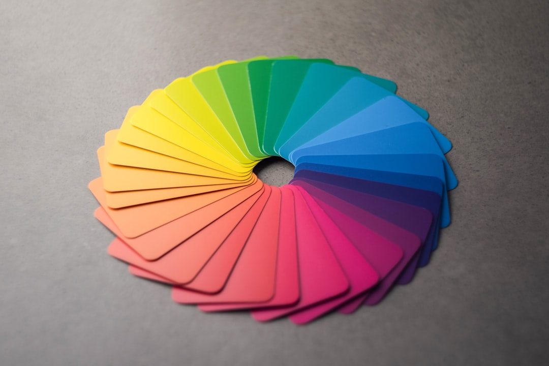
Uses colors opposite each other on the color wheel.
Effect: Vibrant, high-contrast, energetic
Best for: Creating focal points, energetic compositions
Digital tip: Use the complementary color sparingly (80/20 rule) to avoid overwhelming the viewer.
Split Complementary

Uses a base color and two colors adjacent to its complement.
Effect: High contrast but less tension than complementary
Best for: Beginners looking for contrast without harshness
Digital tip: Select your main color, find its complement, then choose colors 30° to either side of the complement.
Triadic
Uses three colors equally spaced around the color wheel.
Effect: Vibrant, balanced, colorful
Best for: Bold, playful designs
Digital tip: Choose colors at 120° intervals on the color wheel, but use one as the dominant color and the others as accents.
Tetradic (Double Complementary)
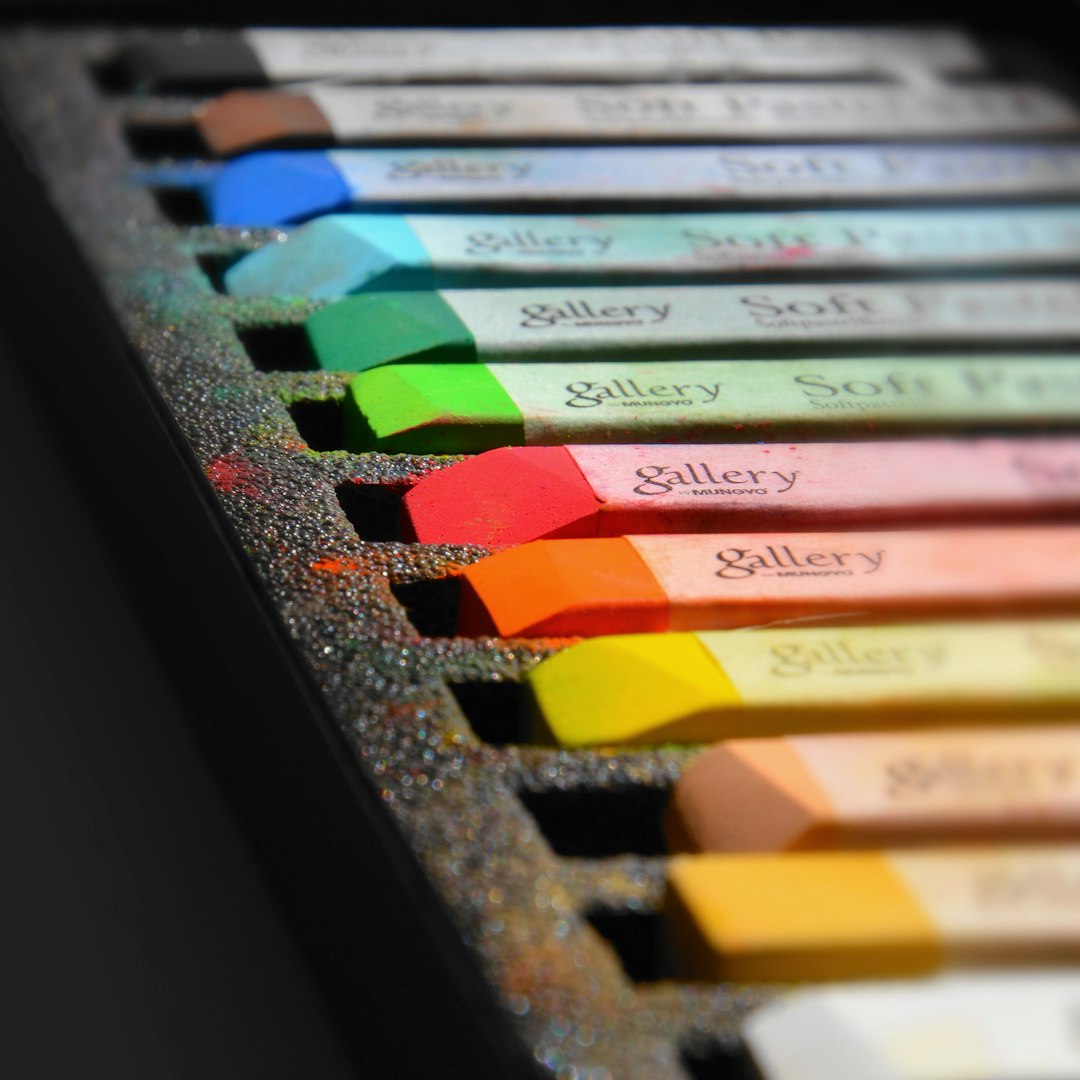
Uses four colors arranged in two complementary pairs.
Effect: Rich, complex, potentially overwhelming
Best for: Complex illustrations, advanced color users
Digital tip: Select one color as dominant and use the others more sparingly. Adjusting the saturation of some colors can help balance the scheme.
Color Psychology in Art
Colors evoke emotional and psychological responses in viewers. While these associations can vary by culture, there are some common psychological effects that digital artists can leverage:
Red
Evokes: Passion, energy, danger, excitement
Digital usage: Use for focal points, calls to action, or to create tension. Be cautious with large areas of red as it can be overwhelming.
Orange
Evokes: Enthusiasm, creativity, warmth, approachability
Digital usage: Great for areas you want to draw attention to without the intensity of red. Works well for highlighting interactive elements.
Yellow
Evokes: Optimism, clarity, warmth, energy
Digital usage: Use for accents and highlights. Can be difficult to read text on yellow backgrounds.
Green
Evokes: Growth, nature, balance, freshness
Digital usage: Creates a sense of balance and harmony. Different shades can vary from energetic (lime) to calming (sage).
Teal/Turquoise
Evokes: Tranquility, clarity, refreshment
Digital usage: Bridges the calming qualities of blue with the freshness of green. Popular in modern digital designs.
Blue
Evokes: Trust, stability, calmness, professionalism
Digital usage: Works well for backgrounds and large areas. Different shades create different moods from energetic to serene.
Purple
Evokes: Luxury, creativity, wisdom, mystery
Digital usage: Use for creating depth or adding a touch of luxury. Lighter purples are playful, deeper ones are more sophisticated.
Pink
Evokes: Playfulness, romance, tenderness
Digital usage: Desaturated pinks can be sophisticated; vibrant pinks create energy and playfulness.
Practical Tips for Digital Artists
1. Start with Value, Then Add Color
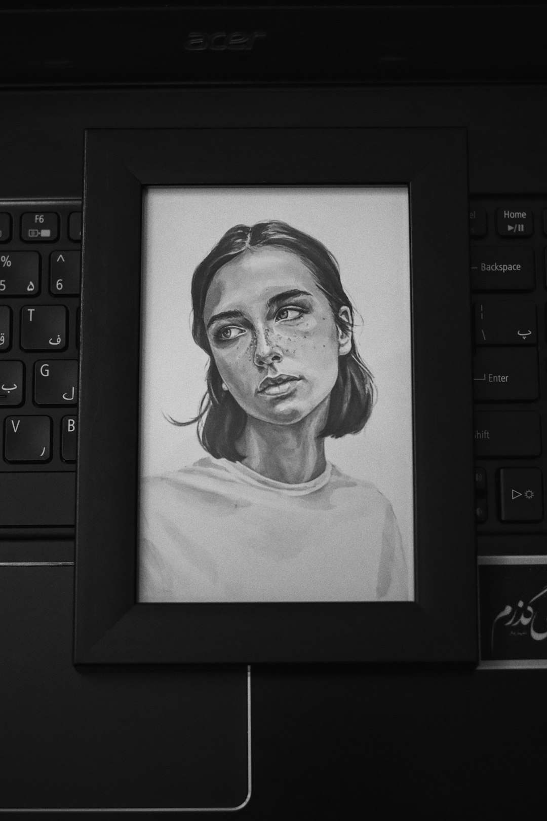
Begin your artwork in grayscale to establish a strong value structure, then add color. This ensures your composition works on a fundamental level before color is introduced.
2. Use Limited Color Palettes
Restrict yourself to 3-5 main colors plus tints and shades. This creates cohesion and forces you to be more deliberate with your color choices. Many masterpieces use surprisingly few base colors.
3. Leverage Digital Color Tools
Use color picker tools, color harmony generators, and saved swatches. Most digital art software includes tools to help you create harmonious color combinations.
Websites like Adobe Color, Coolors, and Paletton can help you generate and experiment with color schemes.
4. Consider Color Contrast for Accessibility
Ensure sufficient contrast between text and backgrounds. This is particularly important for UI design or any art containing text elements.
Online tools like WebAIM's Contrast Checker can help ensure your color combinations are accessible.
5. Use Color to Guide the Viewer's Eye
Place your most saturated or contrasting colors at the focal point of your composition. Our eyes are naturally drawn to areas of high contrast and saturation.
6. Study Color in Master Works
Analyze the color schemes of artwork you admire. Try to identify the color harmony schemes they use and how they create emphasis with color.
You can use the eyedropper tool in your software to sample colors from reference images and create a palette based on work you admire.
7. Understand Light and Shadow Colors
Shadows aren't just darker versions of the base color—they often shift in hue. In natural light, shadows often shift toward blue or purple, while warm light sources create shadows with cooler tones.
8. Use Adjustment Layers and Blending Modes
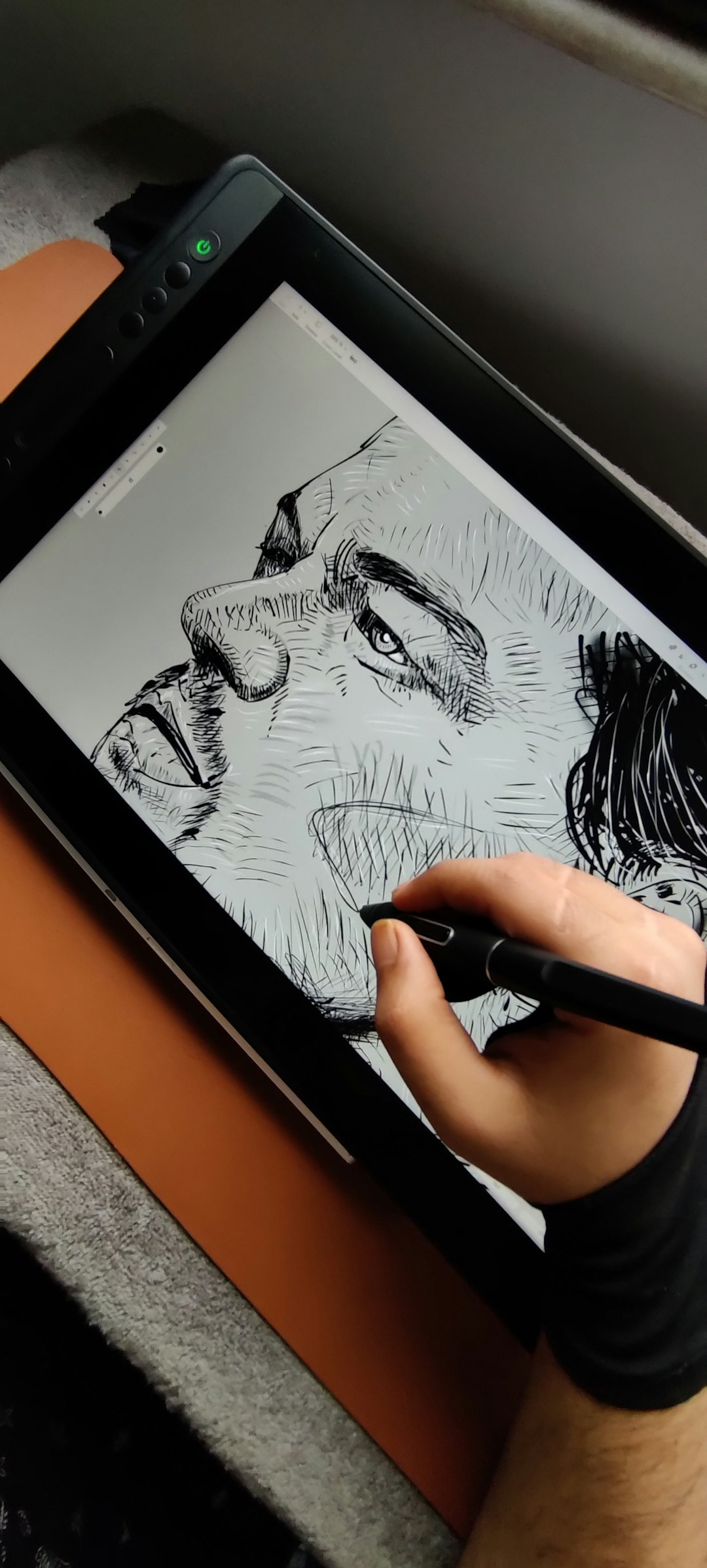
Experiment with adjustment layers and blending modes to modify and harmonize colors non-destructively. Options like Color Balance, Hue/Saturation, and Selective Color give you precise control over your color scheme.
Conclusion
Color theory might seem technical, but it's ultimately about creating emotional connections with your audience. The principles outlined in this article provide a foundation, but don't be afraid to experiment and develop your own color intuition.
Remember that the "rules" of color theory are guidelines rather than strict requirements. Some of the most impactful artwork deliberately breaks these rules to create specific effects or challenge viewer expectations.
The best way to improve your color skills is through deliberate practice. Try creating the same piece with different color schemes, or challenge yourself to work with limited palettes. Over time, your color confidence will grow, and choosing effective color combinations will become second nature.
What aspects of color do you find most challenging in your digital artwork? Share your thoughts and questions in the comments below!

